Thursday 22 April 2010

Sidney Sime

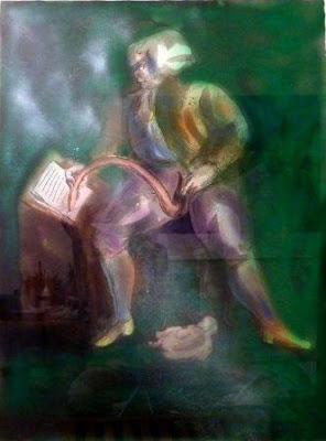
Images from Sidney Sime: Master of the Mysterious by Simon Heneage and Henry Ford - long out of print, but I was lucky enough to get hold of a fairly cheap copy. Born in Manchester, Sime (1867-1941) went, via the University of Liverpool, from a 'scoop-pusher' in the mines to a highly successful satirical and fantastic artist in London, but ended his days as a recluse in the Surrey countryside. He illustrated many of the stories of Lord Dunsany, in a collaboration that lasted fifteen years.

Many more illustrations plus a biography of Sime here.

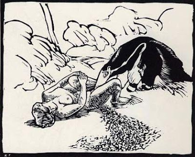
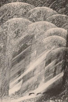
'When we had hunted the moon enough we came back through the wood' - frontispiece for My Talks with Dean Spanley by Lord Dunsany, 1936

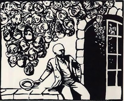
'The Two-Tailed Sogg', from Bogey Beasts, written and illustrated by Sime, 1923

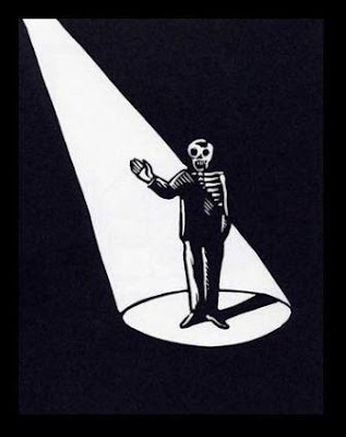
'Hish', illustration for The Gods of Pegana by Lord Dunsany, 1905

Via Monsterbrains, 'Bogus Beast, the Wily Grasser', 1867

Monday 19 April 2010

Kiyoshi Saitō

Woodblock prints by Kiyoshi Saitō (1907-1997), a Japanese artist associated with the sōsaku hanga ('creative prints') movement. From a biography at the Verne Gallery:

"Kiyoshi Saito emerged as Japan's most productive woodblock print artist, whose editions soon found worldwide markets. Sosaku Hanga artists were, however, first dismissed in the Japanese art world and their works were considered concessions to American tastes.

"This abruptly changed however in 1951 at the first Sao Paulo Art Biennial, when a panel of judges gave prizes not to distinguished artists for oil paintings and sculptures but rather to two Hanga artists: for the etchings of Tetsuro Komai as well as to Kiyoshi Saito for a wood block print. The Japanese art world was shocked."

Images found here, there and everywhere. There are a couple more in this previous post.

Eyke Volkmer

Found via But Does It Float, the SF book covers of Eyke Volkmer.

Monday 12 April 2010

Savage Pencil

Various music-related artwork by Savage Pencil, aka Edwin Pouncey. Clicking the images takes you to the individual pages at Discogs, where most of these were found. Pouncey is also a writer and musician, and produces marvellously twisted comic strips for The Wire magazine, such as the one below (click to enlarge).


Thursday 8 April 2010

More is more

"LESS IS NOT NECESSARILY MORE. Being a child of modernism I have heard this mantra all my life. Less is more. One morning upon awakening I realised that it was total nonsense, it is an absurd proposition and also fairly meaningless. But it sounds great because it contains within it a paradox that is resistant to understanding. But it simply does not obtain when you think about the visual of the history of the world. If you look at a Persian rug, you cannot say that less is more because you realise that every part of that rug, every change of colour, every shift in form is absolutely essential for its aesthetic success. You cannot prove to me that a solid blue rug is in any way superior. That also goes for the work of Gaudi, Persian miniatures, art nouveau and everything else. However, I have an alternative to the proposition that I believe is more appropriate. ‘Just enough is more.’"
- Milton Glaser, 10 Things I've Learned

"There’s a certain kind of critic, usually male and British, who finds the exercise of a Romantic imagination to be a suspect and unwholesome activity. That suspicion often sees a single “story” being told in art history which skips from Impressionism to Cubism and ignores the Symbolists and Decadents; it dismisses Dalí’s work after the 1930s and won’t even look at the paintings of HR Giger, Ernst Fuchs or Mati Klarwein; it’s a suspicion which marginalised Mervyn Peake almost to the year of his death in 1968, which scowls at genre fiction and ignored JG Ballard (always a proud science fiction writer) until his Booker Prize nomination in 1984. Minimalism and restraint is favoured over exuberant invention, and a blokey cynicism is favoured over any kind of visionary impulse which is seen as tasteless or kitsch, with “kitsch” in this context almost always meaning “whatever I dislike”. For every Marina Warner, Michael Moorcock, Clive Barker or China Miéville who assert and promote the value of the imagination, you’ll find a vocal crowd who find the whole thing to be unpalatable and juvenile. It’s an older argument than punk versus hippy, going back at least to the nineteenth century debate between Realism and Romanticism. It’s also a peculiarly joyless English attitude; the French have shared the debate as far back as Zola but are generally a lot happier for serious intellectual dialogue to sit side-by-side with comics, movies, science fiction and fantasy."
- John Coulthart on Roger Dean

Monday 5 April 2010

The Polish poster revival

Above: poster by Jerzy Flisak for Anne of the Thousand Days.

BAFTA have an exhibition of Polish and British posters for British films at their headquarters in London. There's a book to accompany the show, available here.

From an article by Michael Brooke in this month's Sight & Sound:

"By displaying Polish and British posters side by side, the new book and exhibition make a particularly strong case for the Polish approach, at least artistically. It's not that the British posters are invariably inferior (there are some excellent examples), but it's impossible to ignore the fact that most of them are hamstrung by clear commercial imperatives, often combined with contractual stipulations regarding source images, type sizes, credit positioning and critical eulogies. As British posters for British films were aimed at typically conservative British audiences, they also had to meet cultural expectations, especially if there was a familiar literary or historical source."

***

Recent purchase: Western Amerykański: Polish Poster Art and the Western. Below: poster by Jan Mlodozeniec for The Life and Times of Judge Roy Bean.


There's a worthwhile documentary on Polish Posters, Freedom on the Fence, which you can order or dowload here. It's pessimistic about the future prospects of the tradition, although the current ubiquity of the Homework duo suggests there may be some hope for it.

Friday 2 April 2010

Poisoning my brain

I couldn't resist posting a few of these works by Roland Topor from Galerie Martel.

"[Learning to draw] should take no more than twenty minutes. But your responsibility is to put your deepest soul on paper, to communicate directly from your nakedness. Anything less is unforgivable. You mustn't do lots of roughs or listen to the client. I draw when I have to draw, when the idea is poisoning my brain so much that I must vomit it out."
- Topor, quoted in All the Art that's Fit to Print

I recently watched a couple of Topor-related films. I was, perhaps inevitably, a little disappointed by Roman Polanski's adaptation of Topor's novel The Tenant. The film is let down by some weak performances, not least from Polanski himself who plays the main character, Trelkovsky. It also lacks the ambiguity of the source material by implying that Trelkovsky's visions are just that - visions, rather than something far weirder.

There's no lack of films about the Marquis de Sade ( Marat/Sade, Quills, Švankmajer's Lunacy), but Marquis is surely the strangest of them all. Some sequences were produced by claymation, but mostly it's performed by actors in animal masks, with the dialogue dubbed afterwards. On the eve of the French revolution, Sade is imprisoned in the Bastille, where he spends most of his time conversing with his penis, which has a face and is called Colin. The words 'not for everyone' spring to mind. Marquis was directed by someone called Henri Xhonneux, who seems to have done little else of note, and Topor is credited as co-writer and art director.

Topor also played Renfield in Werner Herzog's excellent 1979 version of Nosferatu.

This site has several more of his drawings. Previous posts on Topor here and here.