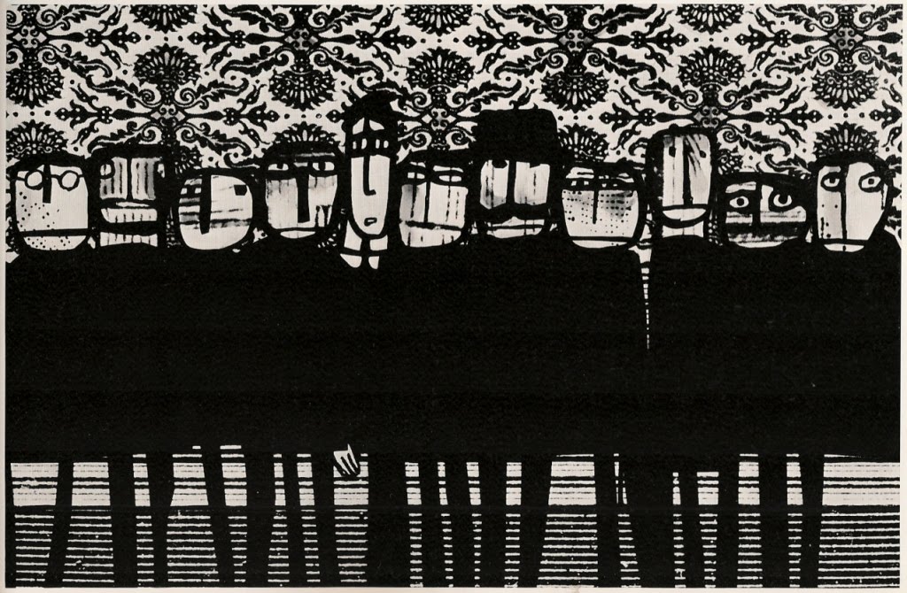


More from Graphis; this time it's the Polish designer and animator Jan Lenica. All but the last of these are stills from his 1970 feature-length animation Adam 2, which I've so far been unable to track down.
From the accompanying text by Alf Brustellin:
[Lenica's] art is, no doubt, literary, and has its literary ancestors. The film artist Lenica can hardly be conceived without Kafka and Ionesco, and far less understood. However, it is certainly not 'literary' in the sense implied by the French producer who had Ionesco write a commentary to Lenica's short film Monsieur Tête in order to make the story more 'comprehensible'. This episode was a grotesque example of a common misunderstanding: Lenica's films have nothing to do with spoken communication, and if anything they tend to defame it. Speech appears in Lenica's work either in the form of evil interpretative signals or as a distorted, meaningless background noise. It proves to be no more than an instrument of power and oppression.
[...]
Adam 2, Lenica's first feature film, which took him nearly three years to complete, is the summing-up and culmination of all inventive effort on the theme of the individual and society (or rather the outsider and society), with the addition of another, Faustian dimension, thought this admittedly does not lead to salvation. Adam 2, a Gulliver of the twentieth century who rushes through worlds and ages in search of the trees of knowledge, produces pure satire only sporadically. The rest is weltanschauung, very personal and very dubious, were it not that the pictures increasingly outgrow their own meaning. The second Adam's plunge into a carnivorous jungle symbolizing womanhood is very nearly indigestible as a metaphor. Yet the orgy of colour, the sultry ceremoniousness of the movements and the scornful yet loving reckoning-up with art nouveau (which Lenica, as one of its victims, is fully entitled to perform) give this intimate report a certain objectivity, making it so much of an optical adventure that the psychological adventure that lies behind it can be forgotten. For that is what does, in fact, lie behind it. Adam 2 undertakes an odyssey that leads from the outer world deeper and deeper into the spiritual hinterland (where the collage technique is no longer apposite) and finally to psychological symbolism. At the neurotic end of his Adam story Lenica cites a scene from Hitchcock's psycho-analytical film Spellbound: doors open without end, an infinity of doors that lead nowhere. Lenica's black spectral beings that demonstrate malice or fatuity in front of gaudy wall-paper patterns are no longer manifestations of social criticism. They are the dark embodiments of an all-involving anxiety. Adam 2, a hopeless Faust with the soul of a child, has not a shadow of a chance. He experiences hell as a place of universal self-torment. In the end, after laborious confrontations, he withdraws from society as an individualist: if he must meet his fate, then at least by his own hand.
I need to see this film.
Previous posts on Lenica here and here.


.jpg)